Facebook Messenger Reverts to Classic Blue Logo
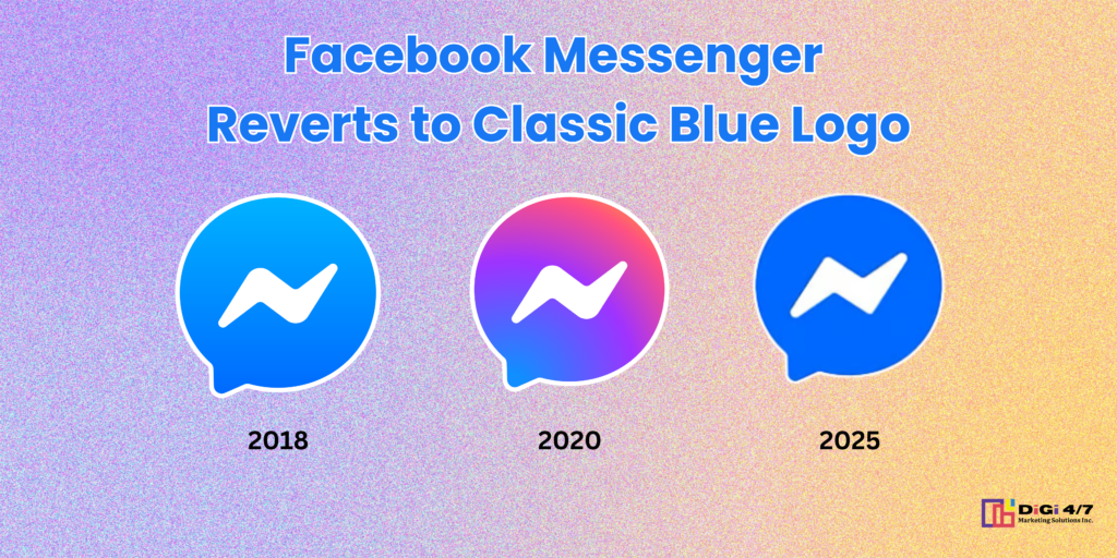
Facebook Messenger has once again changed its logo back to its classic blue color, marking a shift from the gradient hues that had been in place since 2020. This change aligns with Meta’s broader efforts to simplify branding across its suite of applications, including Facebook, Instagram, and WhatsApp.
A Return to Familiarity
The decision to return to the iconic blue shade reflects a strategic move by Meta to reinforce Messenger’s brand recognition. The blue color has long been associated with the platform since its inception, and their version is expected to create a more seamless and familiar experience for users.
The Evolution of Messenger’s Logo
Messenger’s logo has undergone several transformations over the years. Initially introduced with a solid blue background and white chat bubble, the logo evolved to a gradient mix of blue, pink, and purple in 2020 to signify a closer integration with Instagram’s messaging system. However, this latest update suggests a renewed focus on Messenger’s independent identity.
Why the Change?
Meta has not provided an official statement detailing the exact reasons behind the shift, but industry experts speculate that it may be an effort to distinguish Messenger from Instagram Direct and streamline user experience. A unified and recognizable brand identity can also contribute to better user engagement and trust.
What This Means for Users
For users, the change does not impact functionality but serves as a visual cue to Messenger’s standalone presence. The familiar blue logo will likely evoke nostalgia for long-time users while maintaining the modern feel of the app.
Final Thoughts
With this logo rebrand, Messenger returns to its roots while continuing to evolve in functionality. Whether this move is part of a larger rebranding strategy by Meta remains to be seen, but for now, Messenger users can enjoy the familiar blue look they’ve known for years.